The sermon title slide has two main aspects. These are, obviously, the title and the image. Additionally, they could also contain the main scripture reference, the name of the person preaching, or even the date, but these elements aren't necessary.
The first step to creating the sermon slide is to find an image. If Pastor Bruce is preaching, which is usually the case, he will often recommend a visual to go along with his sermon in the email that he sends out early on in the week. This really makes it easy for us (thank you, Pastor Bruce!), but not everybody will do this. Some guest preachers will request very specific photos that are a headache to find, while others just give us a title and let us go on our own to think up of images (if this is the case, and you're really getting stuck, feel free to ask them if they have any ideas for images, or at least for a better idea of what the sermon is about. I would just advise that you don't do this at 10:00 on Saturday night). But since Pastor Bruce preaches the vast majority of Sundays, let's just go with that for now.
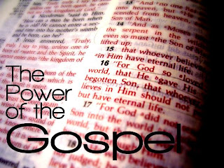
So let's pretend that the image suggestion that Pastor Bruce gave us was "an open Bible" for a sermon entitled "The Power of the Gospel." First, I would search some free stock photo sites (see last post for links). After searching for a while and deciding that none of the open Bible photos would really work for what I want to do, I would pull out my camera and a Bible and take some photos of my own. From my Bible photo shoot, I would decide that I like this photo the best:
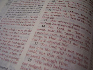
Now, after looking at this picture for a while, I might realize that it's a kind of dull photo. It's all grey, and there isn't really any focal point to it. So I would edit it (my preferred software is Gimp. I'll probably make a post dedicated to it sometime soon), and turn it into something like this:
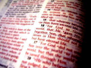
Now that I have a much more visually interesting background photo, it would be time for me to put the words on. I would need to find a font that complements the image, and will be visible on the screens in the MPR. To go with the rather bold look of the image, I might choose something like "Walkway" (downloadable from www.dafont.com), in the UltraBold and Expand Black weights. After some careful text placement, I would have my final image:
Some of my favorite sermon title slides that I've made:
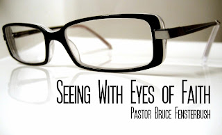
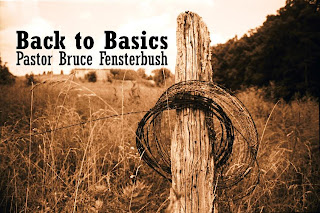
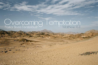
(note: the text in this last one turned out to be entirely unreadable on the screens. So even though it looks cool, don't ever try to use the font "metro.")
You can find a tutorial about making sermon graphics here from Collide Magazine. While you're at it, I'd recommend browsing the rest of the website, as it's all about using Media in churches.

No comments:
Post a Comment